![]()
![]()
![]()
![]()
![]()
![]()
![]()
![]()
![]()
![]()
![]()
![]()
![]()
![]()
![]()
![]()
![]()
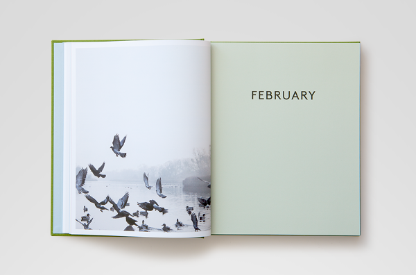
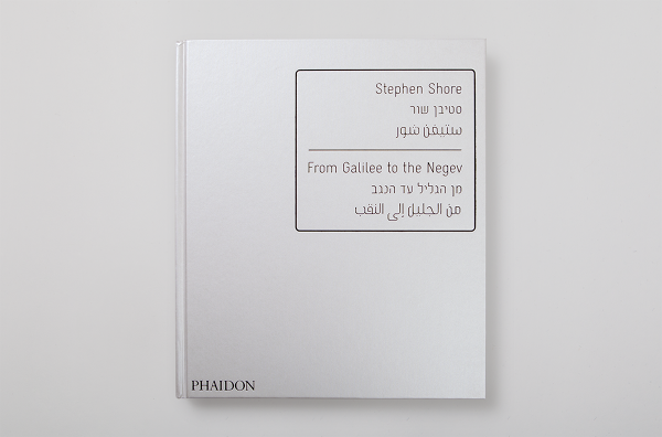
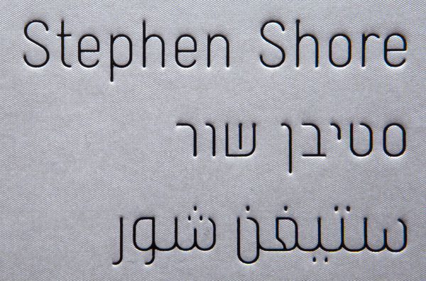
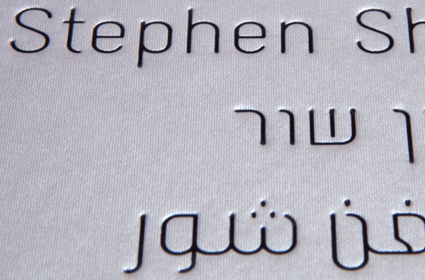
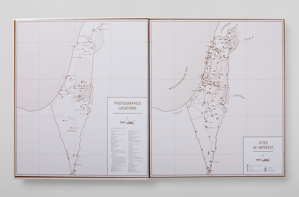
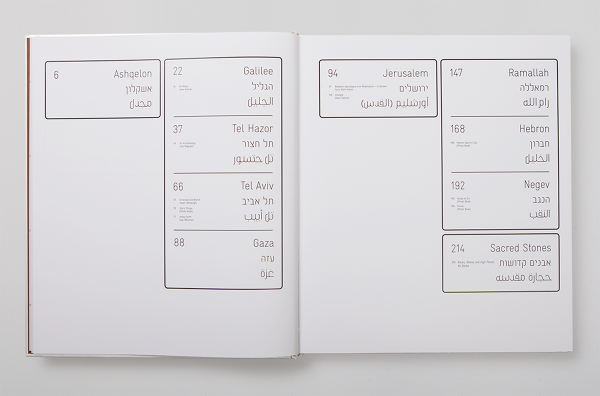
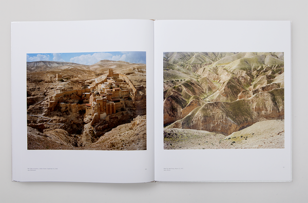
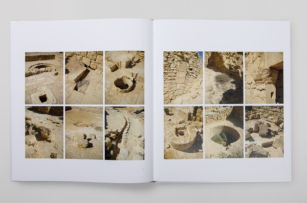
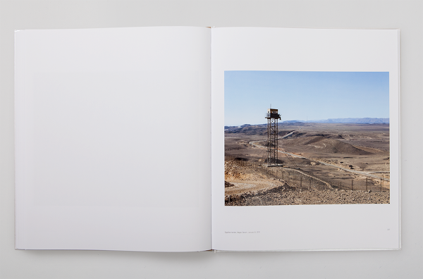
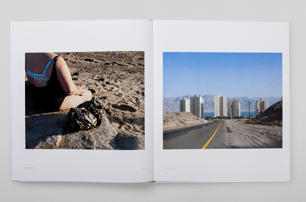
Stephen Shore: From Galilee to the Negev — Stephen Shore's document of Israel is a rare observation by an "outsider". It is a search, but it is also a wayfinding. Shore's discoveries are remarkably accurate - they display the surge in which the daily life moves in this tiny yet versatile place, the cluster and the loneliness, with its beautiful ugliness, and its ethnic diversity that loads the country. When leaving the Ben Gurion airport, the first noticeable artifacts are the road signs in Hebrew, English and Arabic. These signs are intriguing when are observed for the first time, but they are, in a way, an illusion of something greater that could exist there. Shore spots that illusion in his photography and exhibits this far-from-harmonic ethnic diversity that is politically charged and is the heart of the ongoing struggle of everyone who is part of it. He puts reality on display. The cover of this book is blocked on a 3M reflecting material used for road signs, and all the navigational elements in this book (title, contents page, chapter openers) are set in a trilingual cut of the font Gravur Condensed in English, Hebrew, and Arabic.


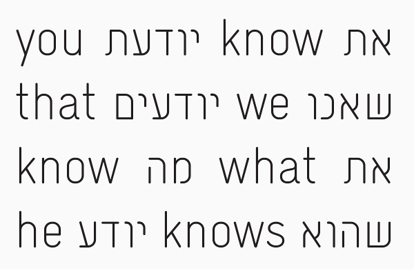 Gravur-Condensed Hebrew — The Hebrew version of the Lineto font Gravur-Condensed, designed by Cornel Windlin and Gilles Gavillet.
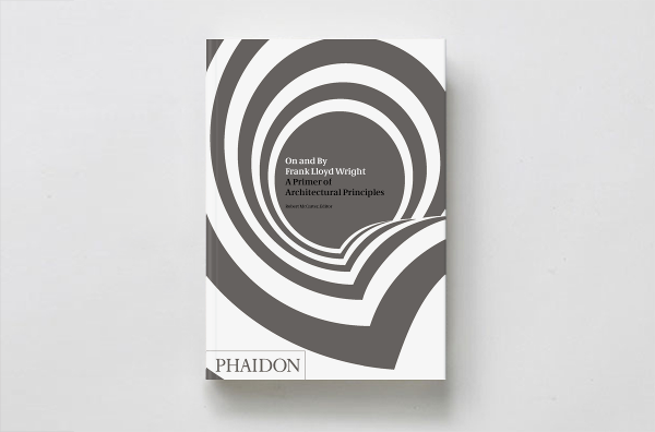
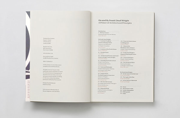
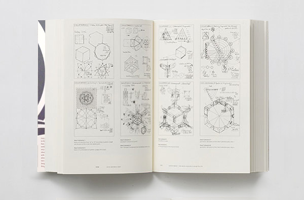 On and By Frank Lloyd Wright — A book containing 14 essays about Frank Lloyd Wright and 3 essays by him. A special version of the typeface Demos, designed by Gerard Unger 1974 was customized for this book to optimize the body text legibility.
Phaidon Press
On and By Frank Lloyd Wright — A book containing 14 essays about Frank Lloyd Wright and 3 essays by him. A special version of the typeface Demos, designed by Gerard Unger 1974 was customized for this book to optimize the body text legibility.
Phaidon Press
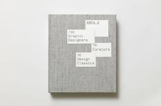
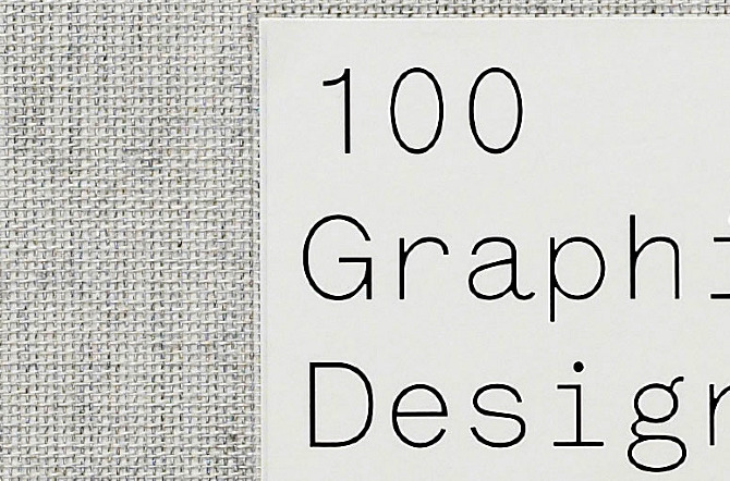
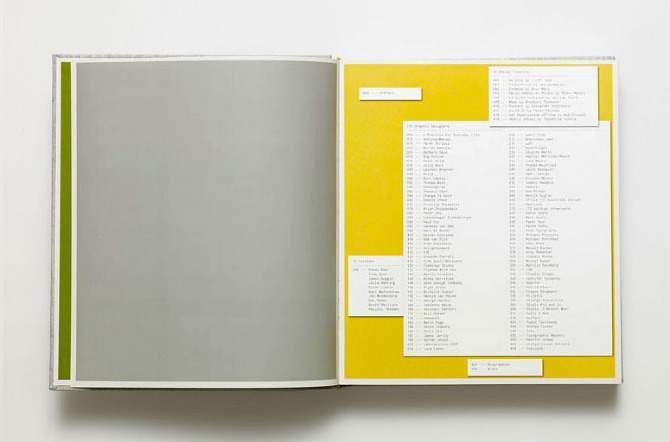
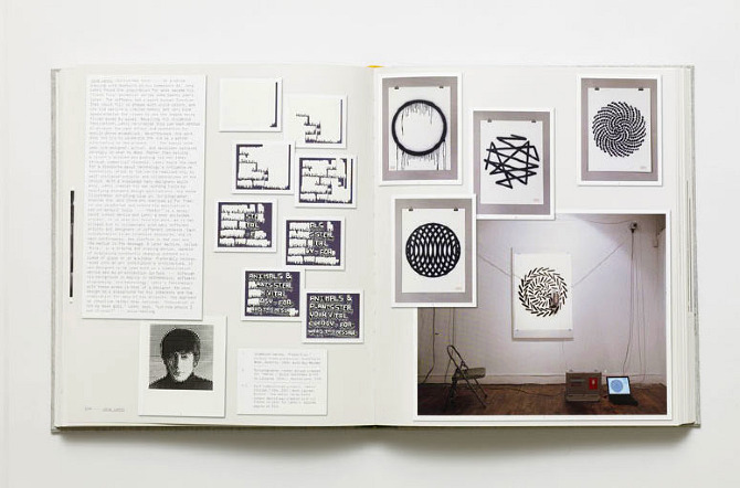
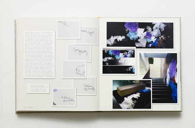
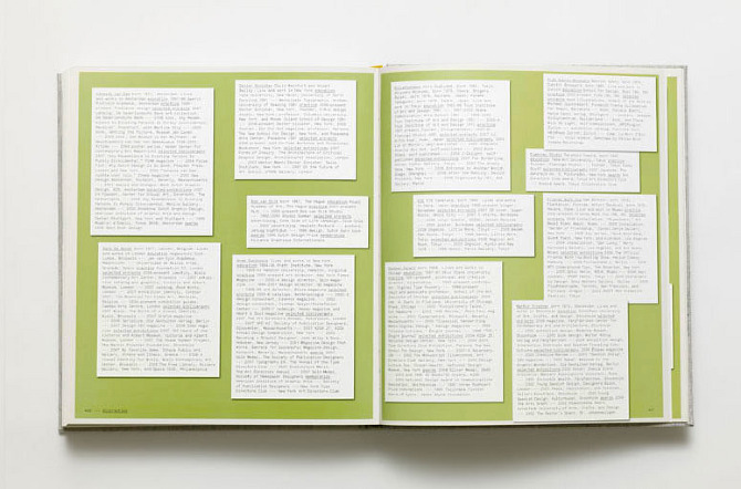 Area 2 (designed with Julia Hasting) — The materials in the book are a range of several different formats and mediums: poster files, photographed books, photographed packages, type specimen renderings, line art illustrations, etc. The concept of the layout was displaying the artwork in the same way we received it from the participating designers: an eclectic collection of images piled on one’s desk. The typeface Lettera was drawn especially for this book, and it was later developed into a four weight family and is sold exclusively through Lineto.
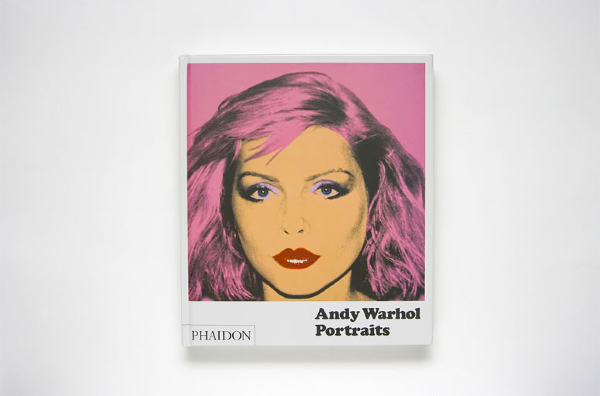
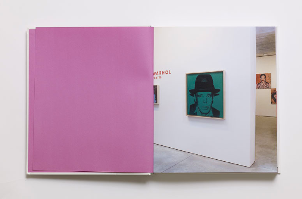
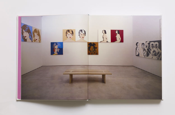
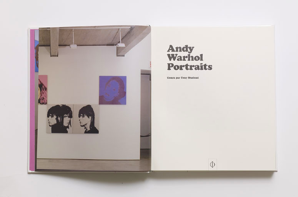
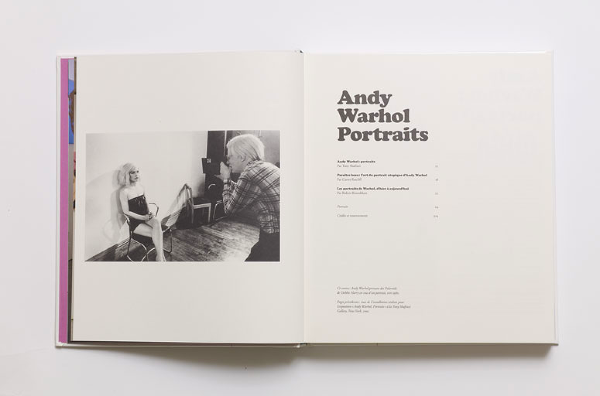
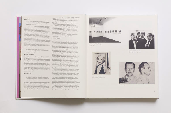
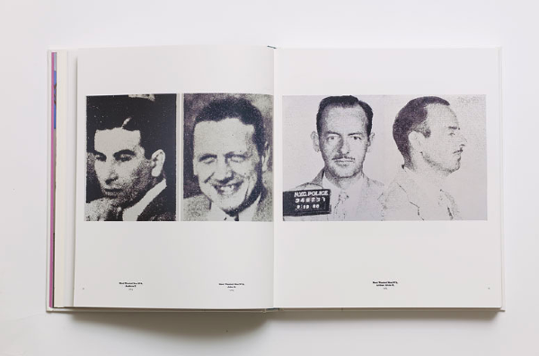
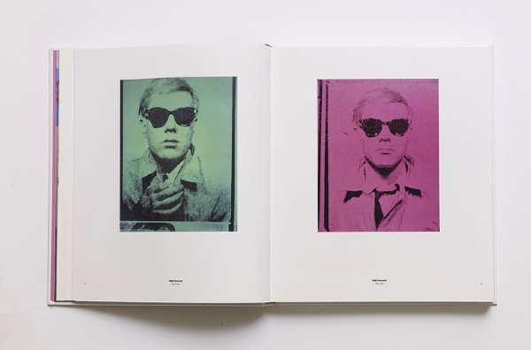
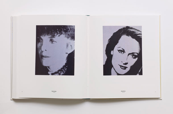 Andy Warhol Portraits — Over 300 pieces of Warhol's Portraiture work made from the early 1960s until his death in 1987.
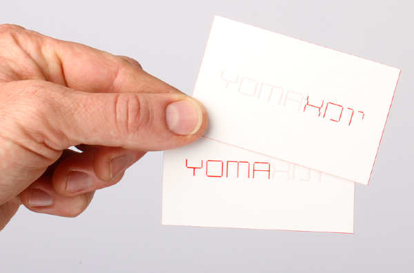
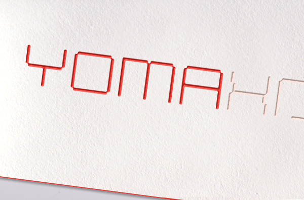
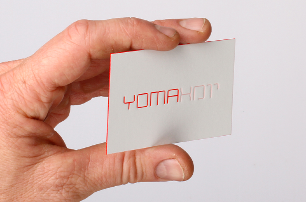
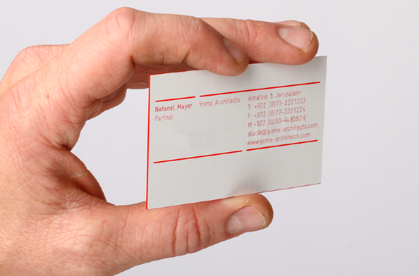 Yoma identity — Yoma is a Jerusalem-based architecture studio, with local, and international clients. The bilingual identity, in Hebrew and English, echos the architectural typology of a line, and line thickness. The logo is a monostroke custom typeface appears on all stationery items at 0.5mm thickness. The letter-pressed business cards are printed on a 0.5mm thick stock, with red gilded edges that three-dimensionally reflect the two-dimensional logo's line thickness.
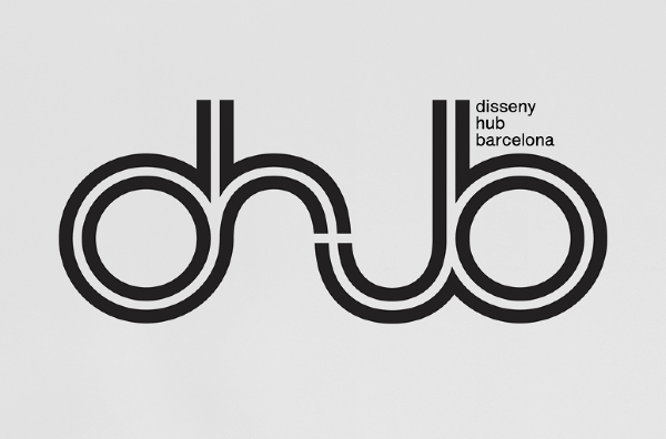
 DHUB Logotype — I was invited by Stephen Barrett and Ariadna Serrahima to participate in a project celebrating the opening of a new Design Museum in Barcelona called Disseny HUB Barcelona (Design Hub Barcelona). The 'HUB' represents a central point of a big and complex system. DHUB opened in early 2009 and as part of the opening celebration, the Fundació Comunicació Gráfica de Barcelona published a compendium containing international designers' suggestion for the museum's logo. The logos were exhibited prior to the opening of the museum and form part of the museum's collection.
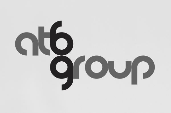
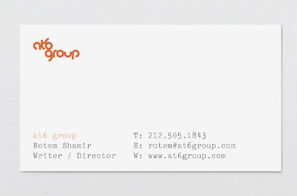 at6 group Identity — The at6 group is a New York-based independent film production company.
2003
at6 group Identity — The at6 group is a New York-based independent film production company.
2003


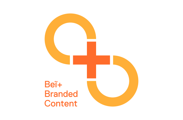
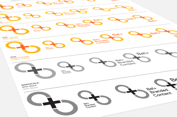
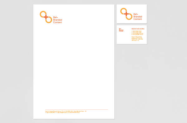 Beĩ+ Identity — Beĩ+ Plus is a branded content entertainment company. It is a subdivision of Beĩ Editoria, a publishing house based in Sao Paolo, Brazil. The company focuses on marketing and communications trends.
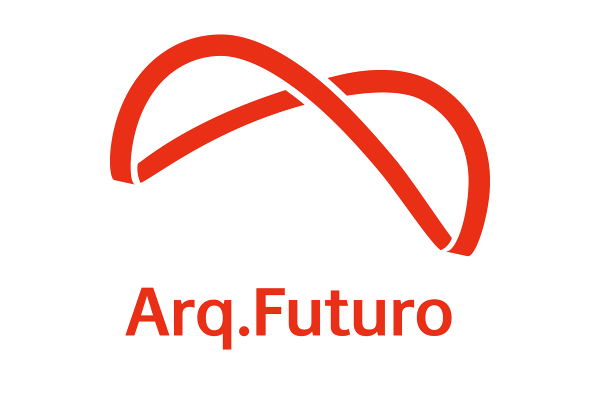
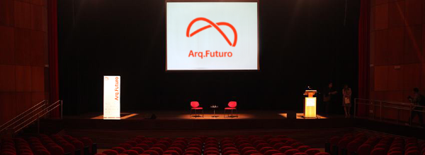
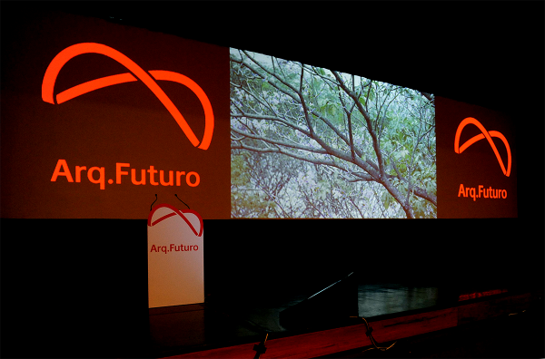
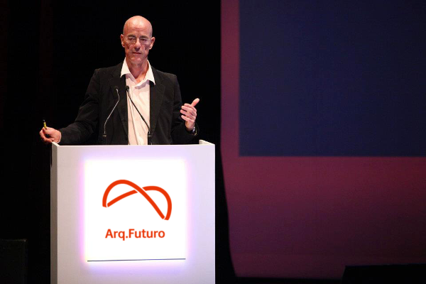
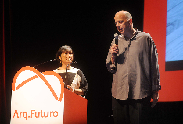 Arq.Futuro Identity — Arq.Futuro is a forum with influential figures in architecture from around the world. Its goal is to raise the level of architectural awareness during an unprecedented building boom as Brazil prepares for the World Cup of 2014 and the Olympic Games in Rio de Janeiro in Summer 2016. The event addresses business/civic leaders and architecture students. Among international speakers are Jaques Herzog, Zaha Hadid, Shigeru Ban and Rafael Viñoly.
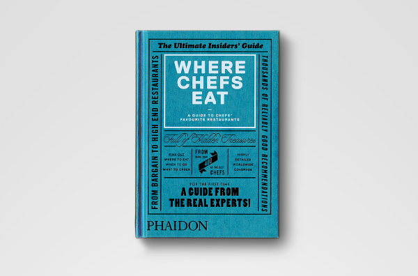
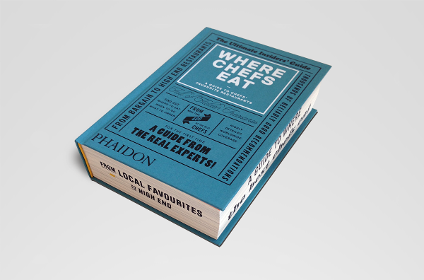


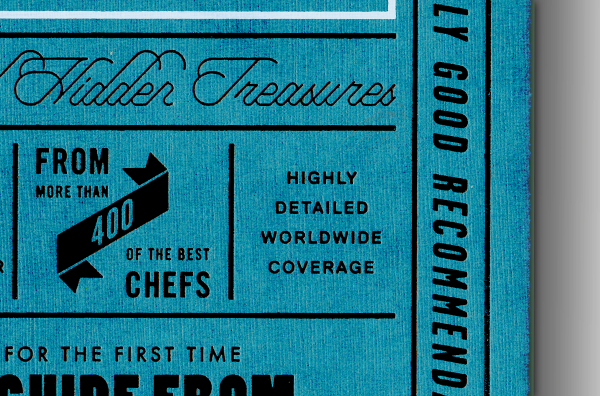
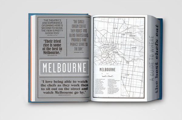
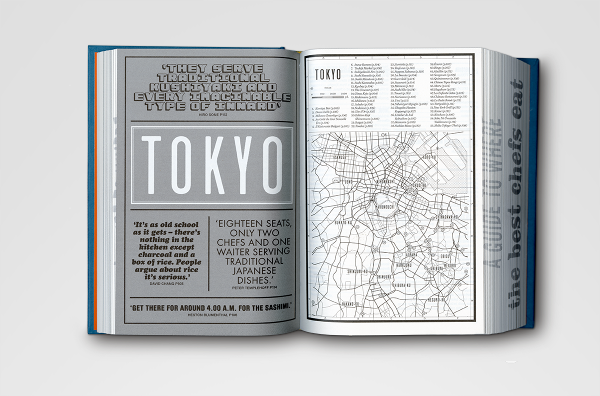
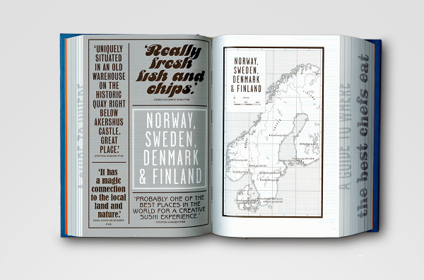
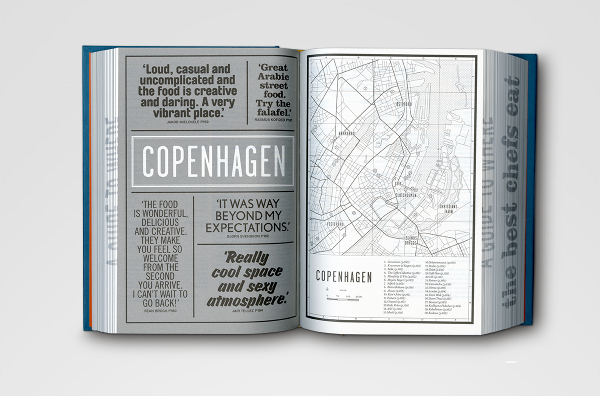
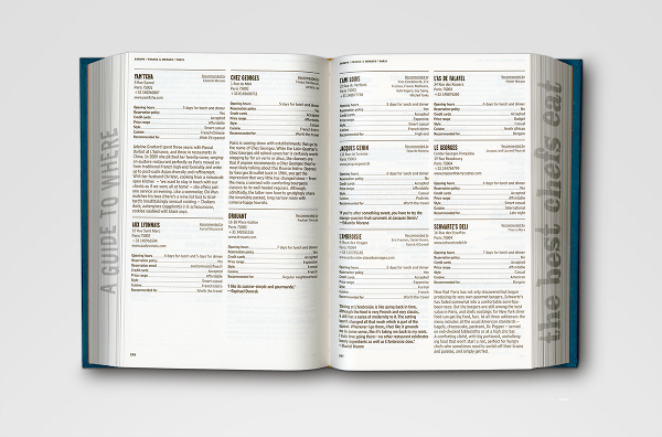
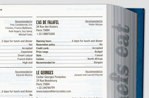
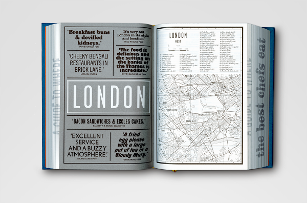
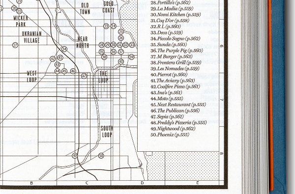
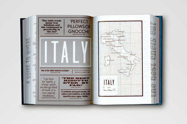
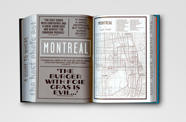
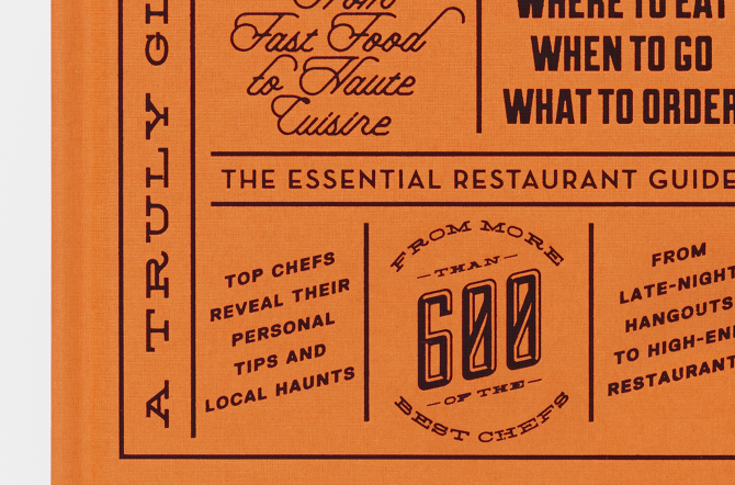
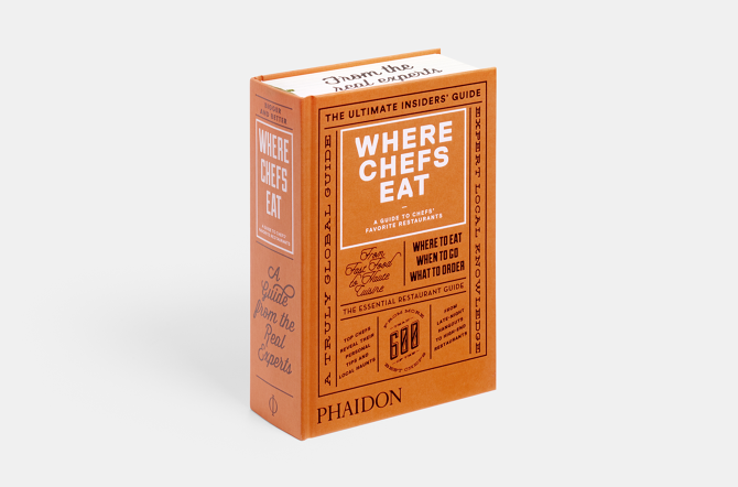
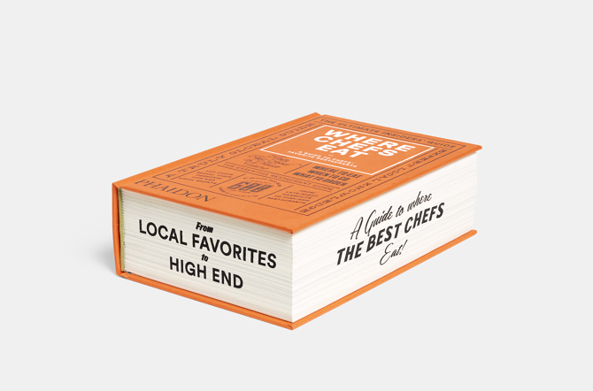
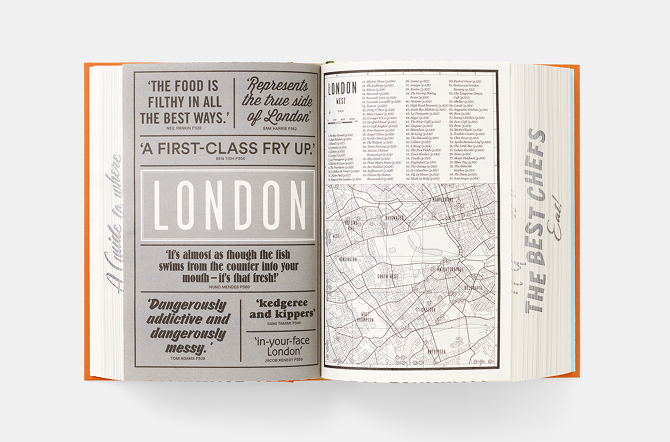
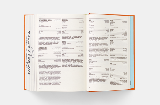
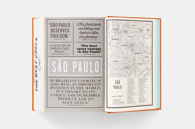
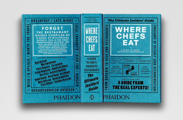 Where Chefs Eat: A Guide to Chefs Favourite Restaurants — A worldwide restaurant guide collecting recommendations from acclaimed international chefs. The mountainous volume of information in this lightweight bulky tome details about 2,300 restaurants around the world. The brief for the book came in a the form of a long list of sales blurbs, and the typographic solution was inspired by 1960's British phone books featuring ads on any possible real estate of the book - the front cover, spine, back cover, and paper edges. The entire book was printed with a single ink - Process Black, and all 704 pages are composed entirely out of typography and cartography. Over 50 different typefaces were used in this book, including a handful of custom made fonts.

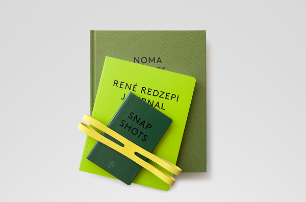
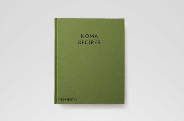
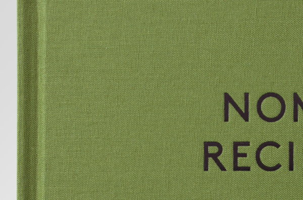
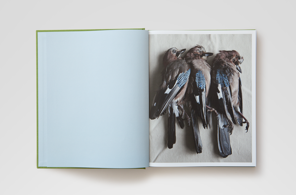
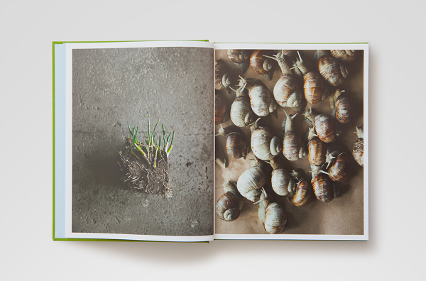
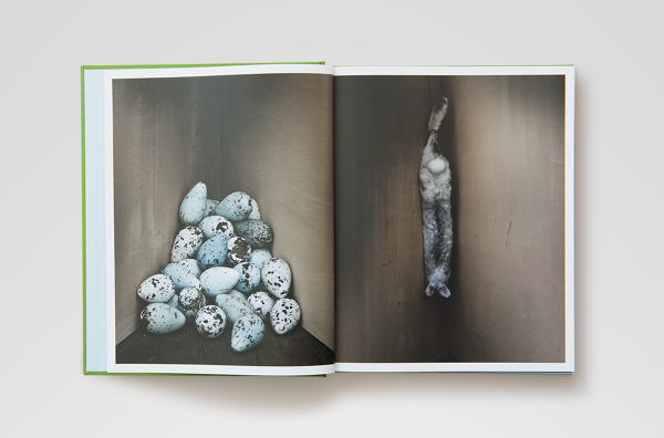
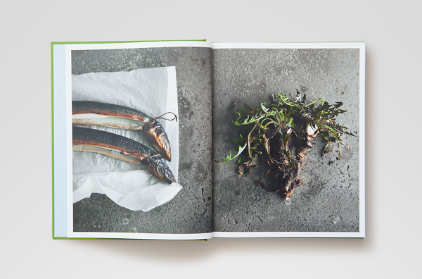
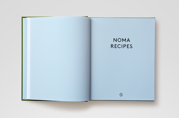
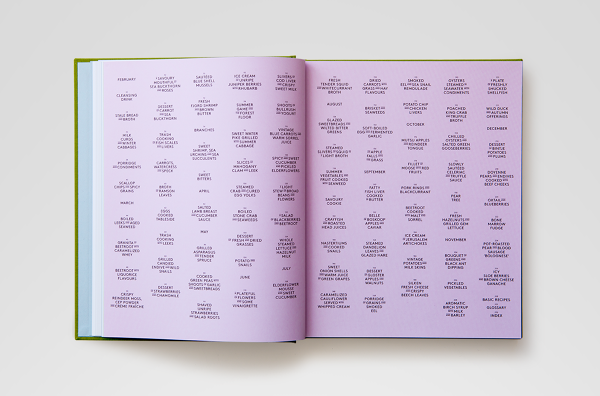
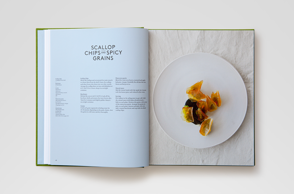
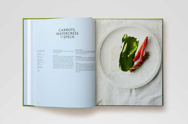
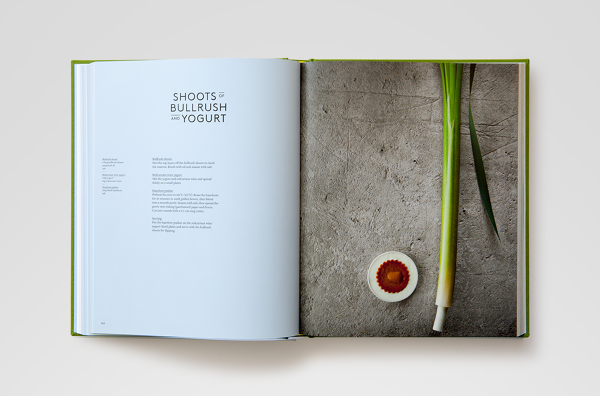
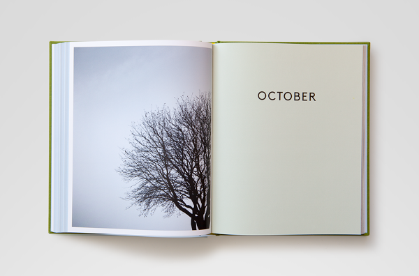
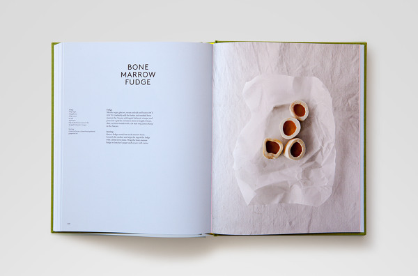
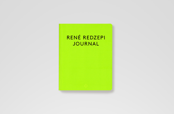
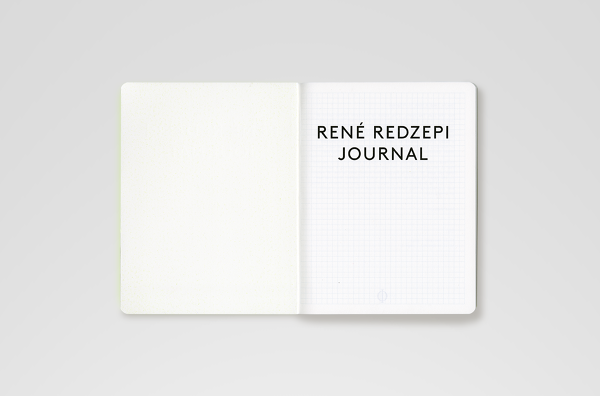
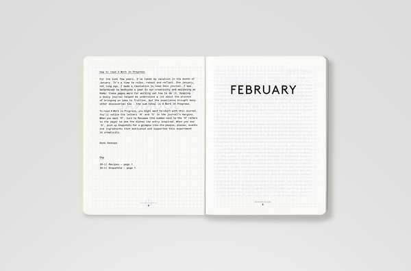
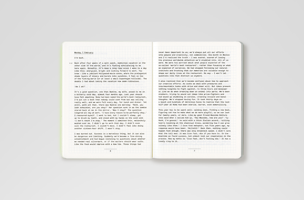
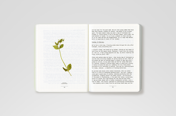
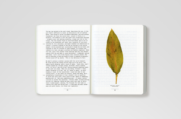
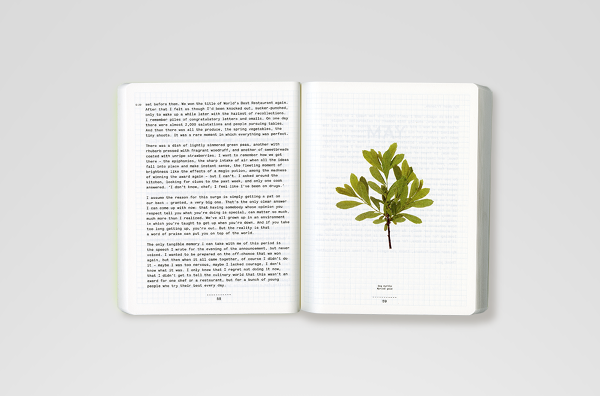
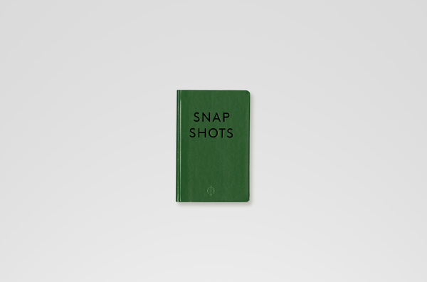
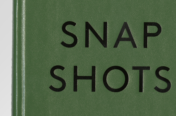
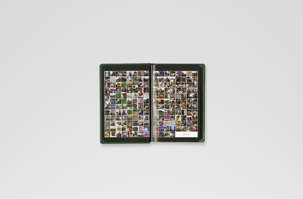
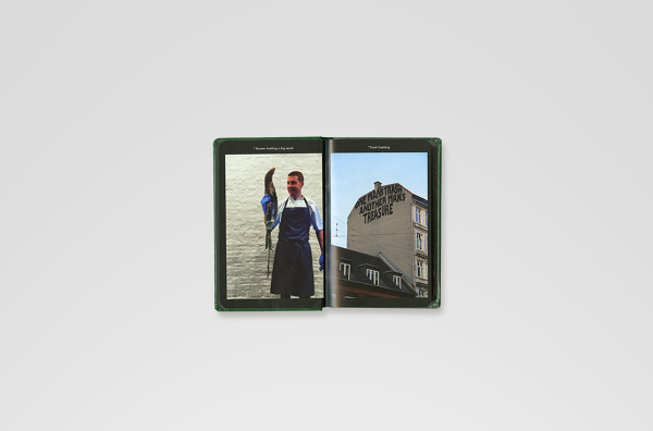
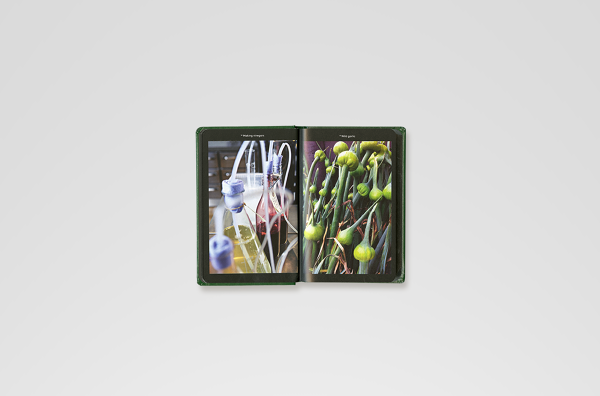
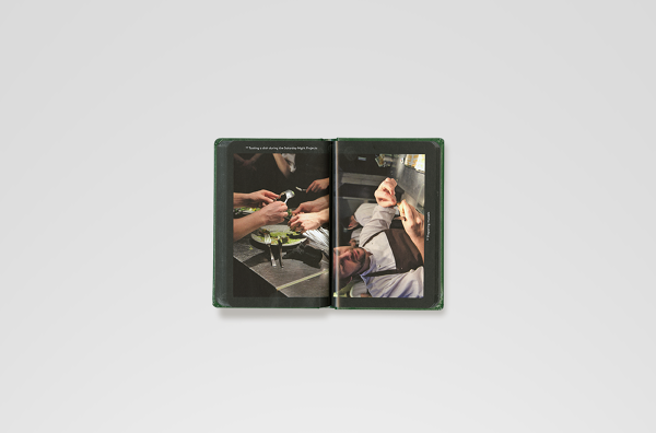
 René Redzepi - A Work in Progress — A documentation of a year at the acclaimed Copenhagen-based restaurant, Noma. The materials for this book were a personal journal recounting the day-to-day life of chef René Redzepi and Noma, accompanied by hundreds of photos gathered from the restaurant's staff smartphones during the same period, and a collection of recipes that were developed that year. The design concept, following the narrative of 'collecting', suggested splitting the publication into three different printed matter: the journal — a soft bound notebook, containing only Redzepi's text, and flat-photographed plants, printed like 'pressed' flowers between the journal's pages; the recipes book — a classic, linen-covered hardback containing ingredient shots and food shots taken by photographer Ditte Isager; the snapshots book — a small format, roughly the size of a smartphone, containing 188 photos, laid out in a way that forces the viewer to rotate the little book from vertical to horizontal format, reflecting the browse through a smartphone photo library.


 Paul Chan Selected Writings — A reader co published by Badland Unlimited and the Schaulager Museum in Basel, on the occasion of the exhibition Paul Chan at Schaulager. The book collects the critical essays and texts of the New York-based artist, as appeared, among others, in Artforum, October, and Frieze. The reader is set with attentive typography in black only, with a single reference to Chan's 7 Lights series on the endpapers signifying dawn and dusk, using a gradient of six different fluorescent inks.
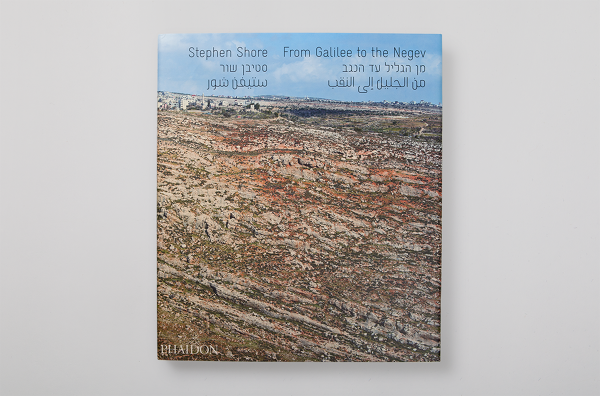
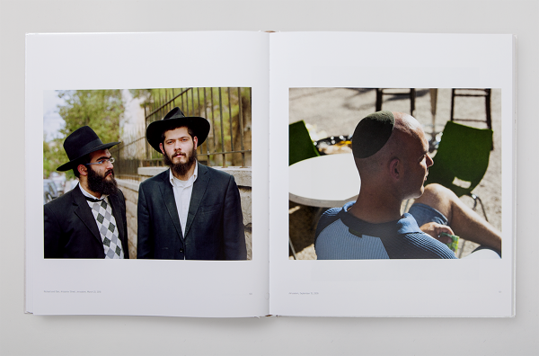
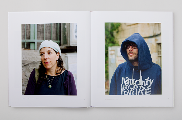
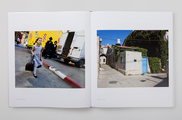
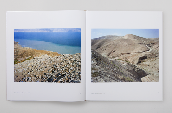
 Stephen Shore: From Galilee to the Negev — Stephen Shore's document of Israel is a rare observation by an "outsider". It is a search, but it is also a wayfinding. Shore's discoveries are remarkably accurate - they display the surge in which the daily life moves in this tiny yet versatile place, the cluster and the loneliness, with its beautiful ugliness, and its ethnic diversity that loads the country. When leaving the Ben Gurion airport, the first noticeable artifacts are the road signs in Hebrew, English and Arabic. These signs are intriguing when are observed for the first time, but they are, in a way, an illusion of something greater that could exist there. Shore spots that illusion in his photography and exhibits this far-from-harmonic ethnic diversity that is politically charged and is the heart of the ongoing struggle of everyone who is part of it. He puts reality on display. The cover of this book is blocked on a 3M reflecting material used for road signs, and all the navigational elements in this book (title, contents page, chapter openers) are set in a trilingual cut of the font Gravur Condensed in English, Hebrew, and Arabic.

 Where Chefs Eat New Edition — The second volume of the successful restaurant guide Where Chefs Eat including new chefs, new restaurants, new maps and new fonts.
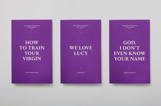
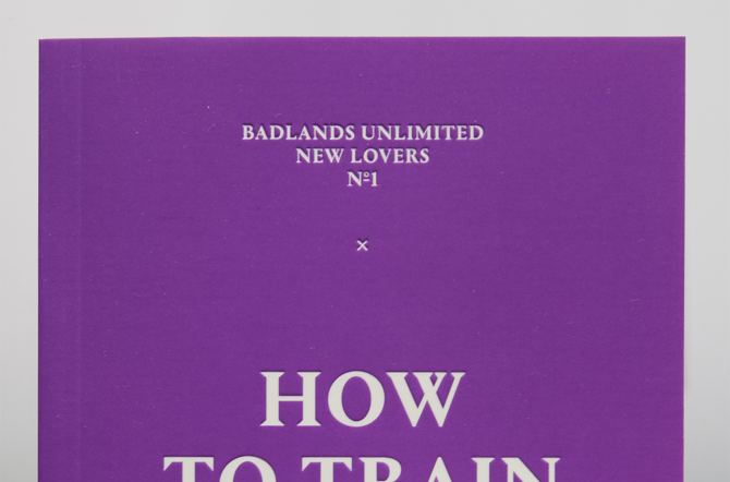
 Badlands Unlimited New Lovers Series — When Paul Chan had asked us to design a series of seven erotic novels in one color and all type for his independent publishing house Badland Unlimited we said it's been on the list of briefs we've been waiting for. This soft-touch debossed paperbacks, the size of a semiotexte book offer provocative yet accessible works by emerging writers in the genre of erotica.


