Stephen Shore: From Galilee to the Negev
Phaidon Press
2014
![]()
![]()
![]()
![]()
![]()
![]()
![]()
![]()
![]()
![]()
![]()
![]()
![]()
![]()
![]()
Stephen Shore's document of Israel is a rare observation by an "outsider". It is a search, but it is also a wayfinding. Shore's discoveries are remarkably accurate - they display the surge in which the daily life moves in this tiny yet versatile place, the cluster and the loneliness, with its beautiful ugliness, and its ethnic diversity that loads the country.
When leaving the Ben Gurion airport, the first noticeable artifacts are the road signs in Hebrew, English and Arabic. These signs are intriguing when are observed for the first time, but they are, in a way, an illusion of something greater that could exist there. Shore spots that illusion in his photography and exhibits this far-from-harmonic ethnic diversity that is politically charged and is the heart of the ongoing struggle of everyone who is part of it. He puts reality on display.
The cover of this book is blocked on a 3M reflecting material used for road signs, and all the navigational elements in this book (title, contents page, chapter openers) are set in a trilingual cut of the font Gravur Condensed in English, Hebrew, and Arabic.


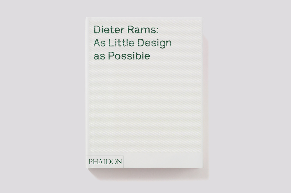
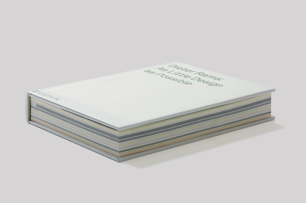
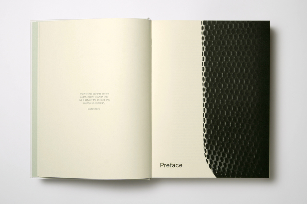
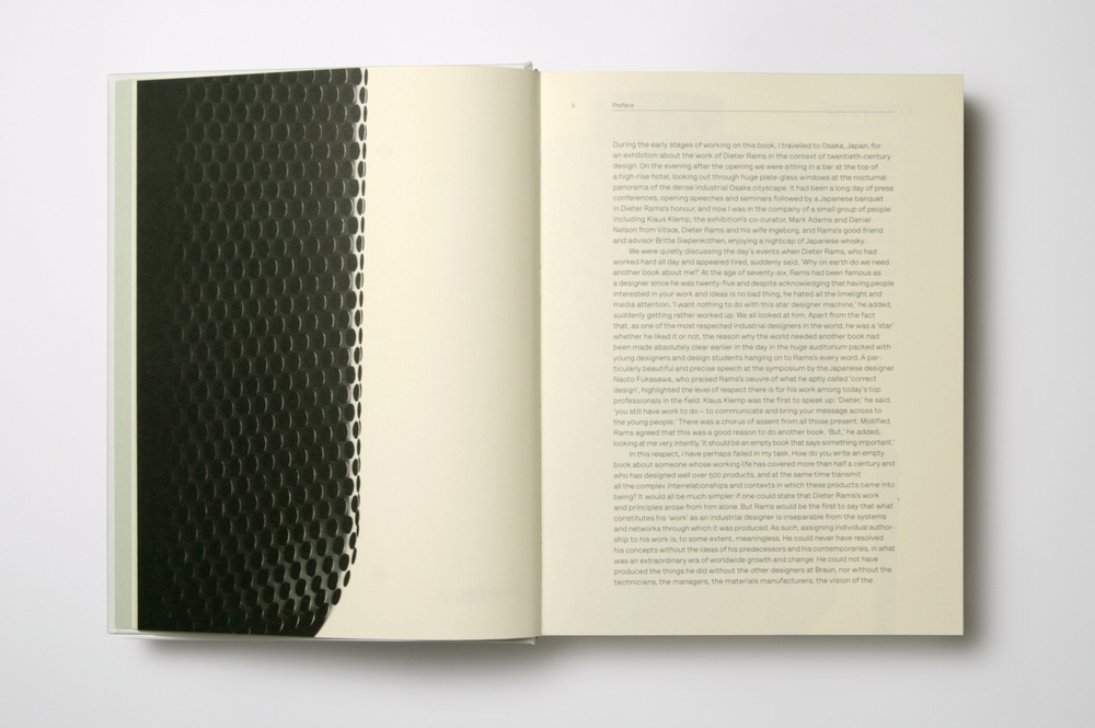
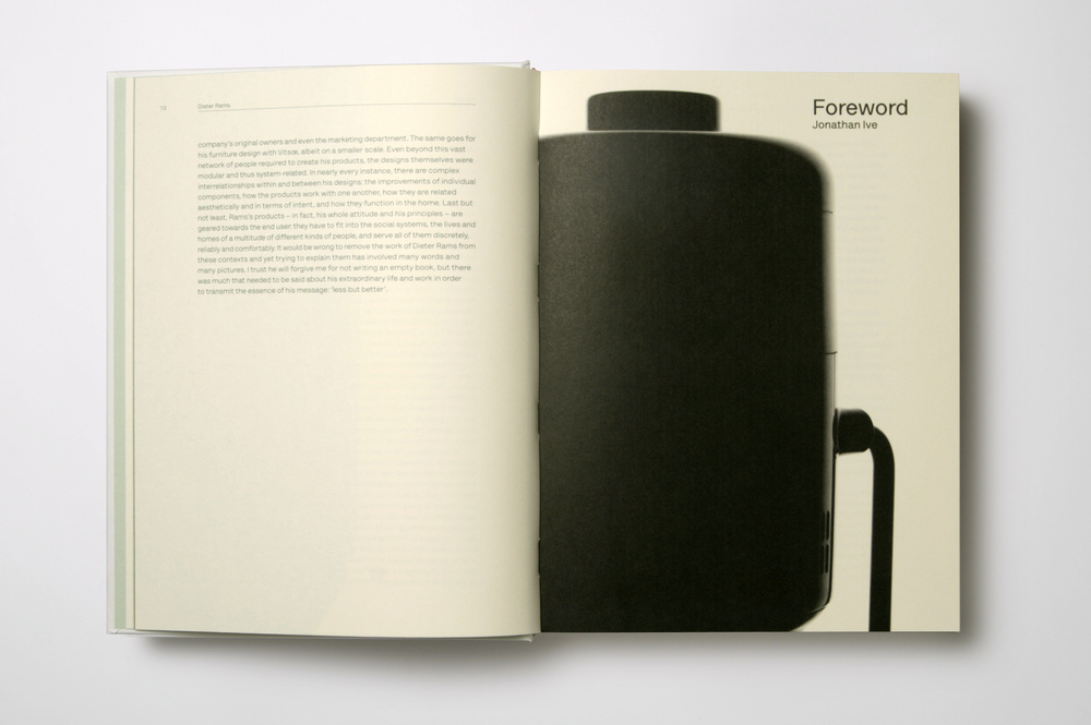
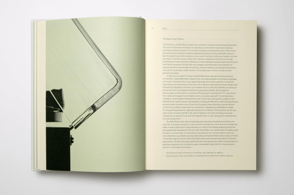
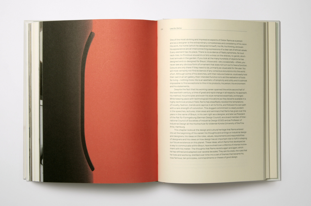
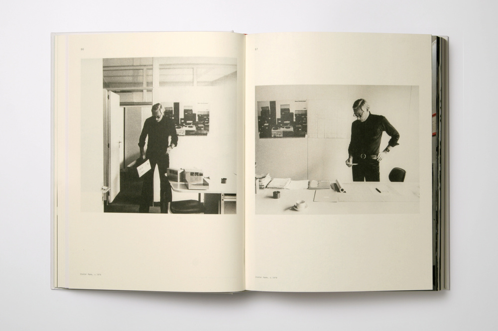
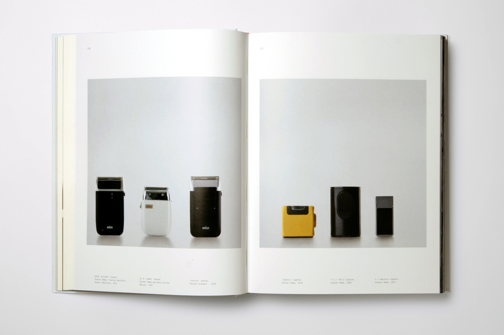
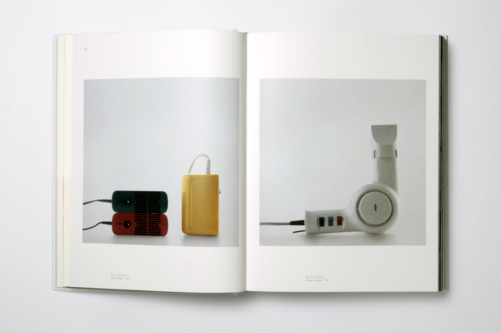
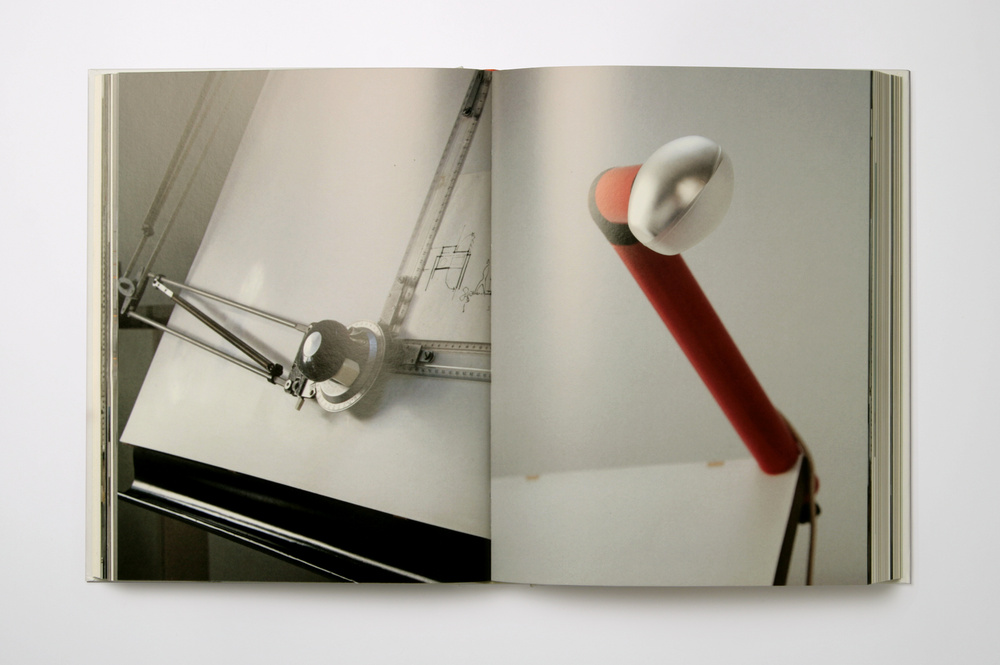
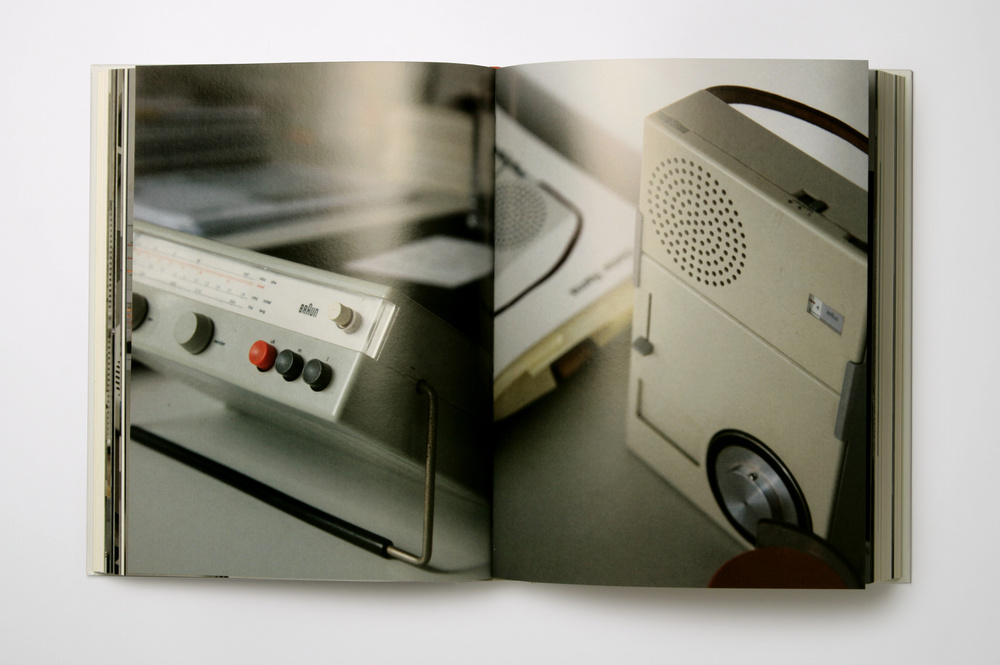
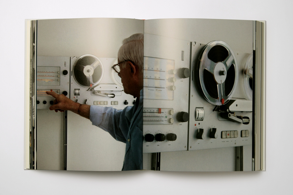
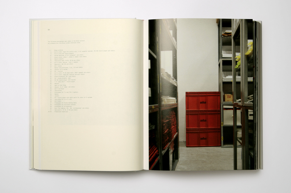
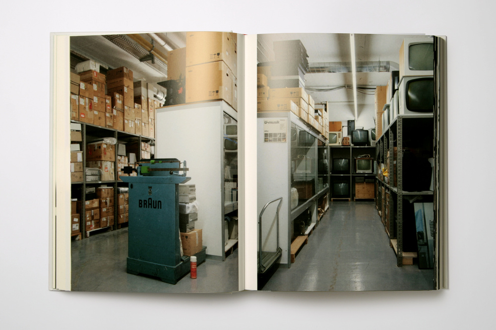
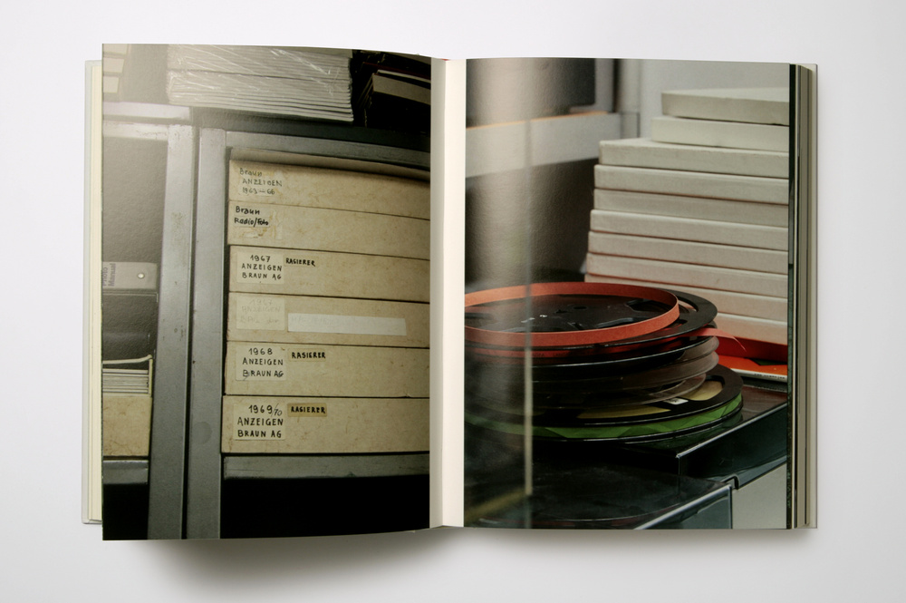 A monograph on the influential product designer Dieter Rams. The fascinating life story of Dieter Rams is laid out in a classic reading book format, with a margin references to corresponding images.
Alongside the historic sketches, prototypes, and product shots of Rams's work, are three sets of photographic portfolios taken at Rams's house in Kronberg, and at the Braun Archive.
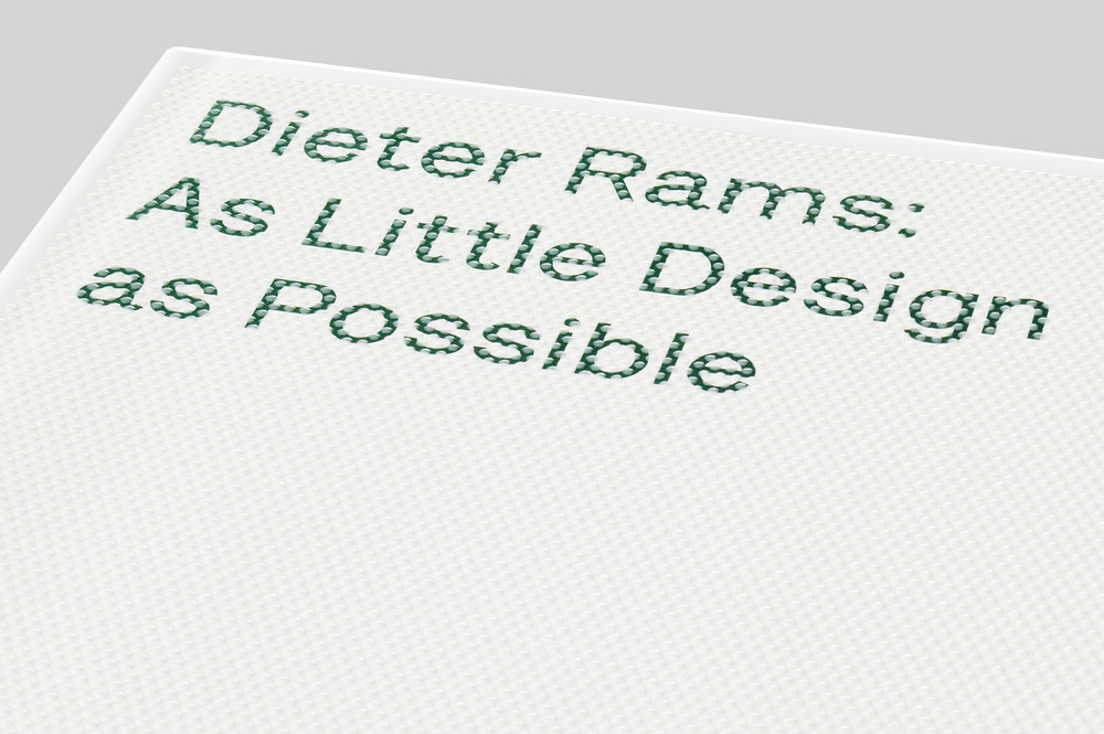
The cover is printed in a unique screen printing technique with raised transparent ink that gives a tactile feel to the design detail. The font Lettera-Txt was designed for this book, and is available at Lineto.
A monograph on the influential product designer Dieter Rams. The fascinating life story of Dieter Rams is laid out in a classic reading book format, with a margin references to corresponding images.
Alongside the historic sketches, prototypes, and product shots of Rams's work, are three sets of photographic portfolios taken at Rams's house in Kronberg, and at the Braun Archive.
The cover is printed in a unique screen printing technique with raised transparent ink that gives a tactile feel to the design detail. The font Lettera-Txt was designed for this book, and is available at Lineto.


 This worldwide restaurant guide collecting recommendations from acclaimed international chefs. The mountainous volume of information in this lightweight bulky tome details about 2,300 restaurants around the world.
The brief for the book came in a the form of a long list of sales blurbs, and the typographic solution was inspired by 1960's British phone books featuring ads on any possible real estate of the book - the front cover, spine, back cover, and paper edges.
The entire book was printed with a single ink - Process Black, and all pages are composed entirely out of typography and cartography. Over 50 different typefaces were used in this book, including a handful of custom made fonts.
This worldwide restaurant guide collecting recommendations from acclaimed international chefs. The mountainous volume of information in this lightweight bulky tome details about 2,300 restaurants around the world.
The brief for the book came in a the form of a long list of sales blurbs, and the typographic solution was inspired by 1960's British phone books featuring ads on any possible real estate of the book - the front cover, spine, back cover, and paper edges.
The entire book was printed with a single ink - Process Black, and all pages are composed entirely out of typography and cartography. Over 50 different typefaces were used in this book, including a handful of custom made fonts.


 A documentation of a year at the acclaimed Copenhagen-based restaurant, Noma.
The materials for this book were a personal journal recounting the day-to-day life of chef René Redzepi and Noma, accompanied by hundreds of photos gathered from the restaurant's staff smartphones during the same period, and a collection of recipes that were developed that year.
The design concept, following the narrative of 'collecting', suggested splitting the publication into three different printed matter:
The Journal — a soft bound notebook, containing only Redzepi's text, and flat-photographed plants, printed like 'pressed' flowers between the journal's pages
The recipes book — a classic, linen-covered hardback containing ingredient shots and food shots taken by photographer Ditte Isager
The snapshots book — a small format, roughly the size of a smartphone, containing 188 photos, laid out in a way that forces the viewer to rotate the little book from vertical to horizontal format, reflecting the browse through a smartphone photo library.
A documentation of a year at the acclaimed Copenhagen-based restaurant, Noma.
The materials for this book were a personal journal recounting the day-to-day life of chef René Redzepi and Noma, accompanied by hundreds of photos gathered from the restaurant's staff smartphones during the same period, and a collection of recipes that were developed that year.
The design concept, following the narrative of 'collecting', suggested splitting the publication into three different printed matter:
The Journal — a soft bound notebook, containing only Redzepi's text, and flat-photographed plants, printed like 'pressed' flowers between the journal's pages
The recipes book — a classic, linen-covered hardback containing ingredient shots and food shots taken by photographer Ditte Isager
The snapshots book — a small format, roughly the size of a smartphone, containing 188 photos, laid out in a way that forces the viewer to rotate the little book from vertical to horizontal format, reflecting the browse through a smartphone photo library.


 Stephen Shore's document of Israel is a rare observation by an "outsider". It is a search, but it is also a wayfinding. Shore's discoveries are remarkably accurate - they display the surge in which the daily life moves in this tiny yet versatile place, the cluster and the loneliness, with its beautiful ugliness, and its ethnic diversity that loads the country.
When leaving the Ben Gurion airport, the first noticeable artifacts are the road signs in Hebrew, English and Arabic. These signs are intriguing when are observed for the first time, but they are, in a way, an illusion of something greater that could exist there. Shore spots that illusion in his photography and exhibits this far-from-harmonic ethnic diversity that is politically charged and is the heart of the ongoing struggle of everyone who is part of it. He puts reality on display.
The cover of this book is blocked on a 3M reflecting material used for road signs, and all the navigational elements in this book (title, contents page, chapter openers) are set in a trilingual cut of the font Gravur Condensed in English, Hebrew, and Arabic.
Stephen Shore's document of Israel is a rare observation by an "outsider". It is a search, but it is also a wayfinding. Shore's discoveries are remarkably accurate - they display the surge in which the daily life moves in this tiny yet versatile place, the cluster and the loneliness, with its beautiful ugliness, and its ethnic diversity that loads the country.
When leaving the Ben Gurion airport, the first noticeable artifacts are the road signs in Hebrew, English and Arabic. These signs are intriguing when are observed for the first time, but they are, in a way, an illusion of something greater that could exist there. Shore spots that illusion in his photography and exhibits this far-from-harmonic ethnic diversity that is politically charged and is the heart of the ongoing struggle of everyone who is part of it. He puts reality on display.
The cover of this book is blocked on a 3M reflecting material used for road signs, and all the navigational elements in this book (title, contents page, chapter openers) are set in a trilingual cut of the font Gravur Condensed in English, Hebrew, and Arabic.


 This catalogue, for Frank Stella's retrospective at the Whitney Museum of American Art and the Modern Art Museum of Fort Worth, is the most comprehensive presentation of Stella’s career to date, showcasing his prolific output from the mid-1950s to the present through approximately 100 works, including paintings, reliefs, maquettes, sculptures, and drawings. The book's cover is die cut to the contour of Stella's shaped-canvas piece Conway I.


 The most comprehensive book on architect and designer Marcel Breuer (1902-1981), looking in detail at all the houses, furniture, and public buildings he designed In Europe and the United States–from his beginning at the Bauhaus through his collaboration with Walter Gropius, and the establishment of his own practice in the USA.
The case of this hardcover volume is made out of a through-dyed, thermo-reactive paper that gives the impression of concrete, with the type and cover elements screen-printed in white.
The most comprehensive book on architect and designer Marcel Breuer (1902-1981), looking in detail at all the houses, furniture, and public buildings he designed In Europe and the United States–from his beginning at the Bauhaus through his collaboration with Walter Gropius, and the establishment of his own practice in the USA.
The case of this hardcover volume is made out of a through-dyed, thermo-reactive paper that gives the impression of concrete, with the type and cover elements screen-printed in white.


 For the exhibition Ametria curator Roberto Cuoghi collected art pieces and artifacts from the Benaki Museum in Athens, and paired them together with pieces from the contemporary collection of Dakis Joannau of the DESTE Foundation, to create a radical exercise in the de-canonization of the curatorial method. The maze-like structure of the show enabled endless navigation paths, resulting in different experiences for each visitor. The installation was composed out of rigidly arranged rectangular black boxes, lit from their bottoms, and the objects were presented on or inside them, without titles or captions, creating an even more challenging and solitary experience. The catalogue follows the documentation of the exhibition and replicates the displays 1:1 two-dimensionally on its black pages. The book block is covered completely in deep black, except a hint of light from the bottom page edges. Each copy was carefully hand sprayed in an auto body shop.